Behind the design with Neil Grunshaw
To celebrate our Centenary year we have released a special commemorative kit in partnership with Le Col. We caught up with kit designer Neil Grunshaw to find out what goes into designing a club kit and where he got inspiration for the retro-inspired jersey.
What was the inspiration for the Centenary kit?
We only had custom kit relatively recently (think it was the 90s?) so for a truly retro-looking kit we had to go way back.
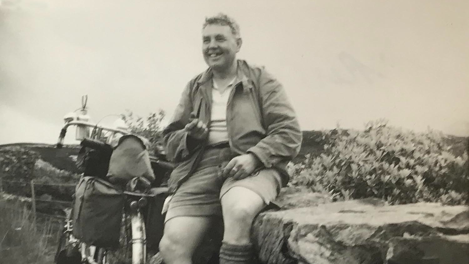
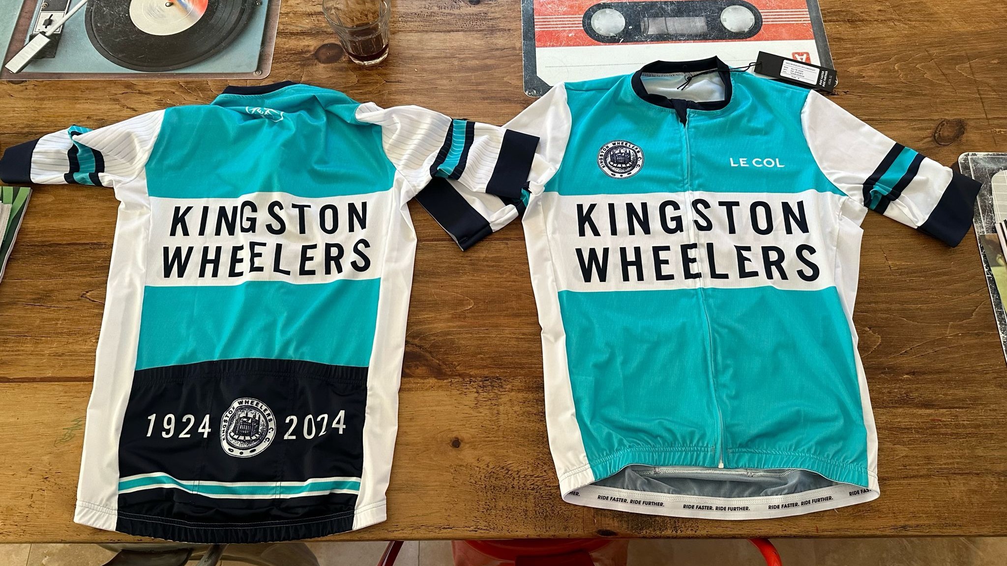
Members used to wear generic kit in the official club colour – Kingfisher Blue – perhaps with some DIY felt lettering stitched on. I took details from some of those jerseys from the 60s, 70s and 80s using photos from the club archive, expertly maintained by Gafyn. I smashed some of these together and created an “imagined” club kit from decades past – so the centenary kit is old school club kit that never really existed. I think it looks authentic enough for one to imagine that it did exist whilst rolling through sun-dappled lanes on a vintage Colnago.
The typography is the club typeface since 2018 (Alternate Gothic, type nerds) so it still ties into the modern kit. All we did to create the shorts was make the colour black and add ‘1924’ to the logo on the back – boom. The current shorts were retro-inspired anyway – the BIG TYPE on the legs is straight from the peloton of the 50s/60s.
Where do you start with a new kit design?
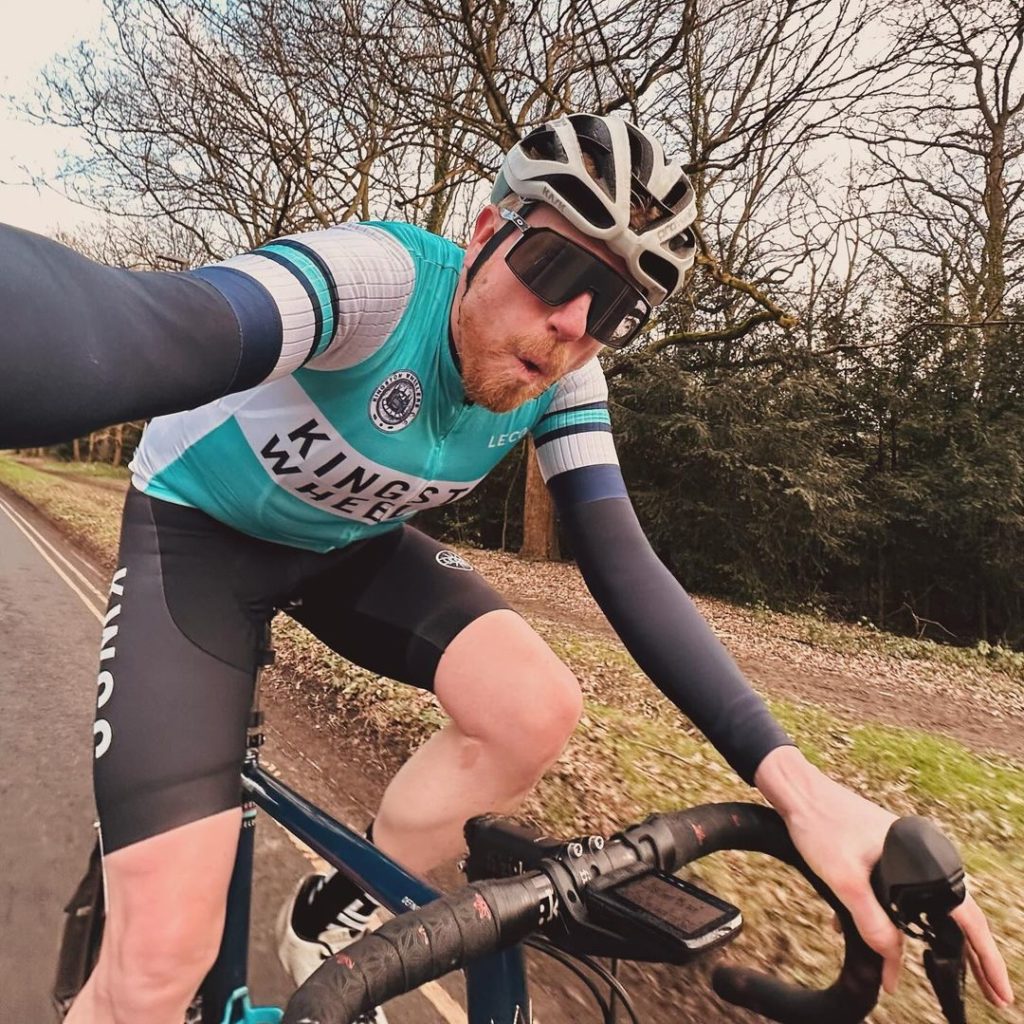
I only design kit for us – I’m an animator by trade, so it’s not like I’m knocking out jerseys every week. The main thing is the ‘why’ – why are we creating this? In the case of the current kit, we were updating a design that was looking a little out-of-date and busy – I think the previous kit had ‘Kingston Wheelers’ written on it 12 times!
So to address that, we simplified it; kept the same balance of colours, plenty of white (you can spot a Wheeler up the road from a mile away) and cleaned up the type. As has been said, we looked to the classic club kits of the 50s/60s for inspiration while still keeping a modern, clean look.
The Centenary kit practically designed itself after a little research.
The Crazy Swan/Psycleklub/Volunteer jersey was an April Fools that got out of hand in response to the bonkers EF x Palace x Rapha kit debut at the 2021 Giro. Literally took 20 mins. “Don’t overthink it” is the message here. Also it was Harry’s fault.
Do you need to work closely with Le Col to bring the design to life?
They aren’t involved in the creative process but they expertly advise us on what will and won’t work in print, flagging ideas that aren’t technically possible or may cause issues across all the sizes. As has been mentioned, I work in digital moving image not garment design, so their technical feedback is welcome and essential. They do a great job, and their gear is top-notch.
How did you create the roundel design with the coronation stone?
With a load of faff! I tried various methods of digitising the Kings Stone emblem using scans of old ephemera, medal engravings etc – all of which looked rubbish. Eventually I got a good scan of an old club stamp and used AI tools in the latest Photoshop to up-res it, and cleaned it up the old-fashioned way by retouching it using a Wacom tablet.
Why did you add the black shorts to go with the jersey?
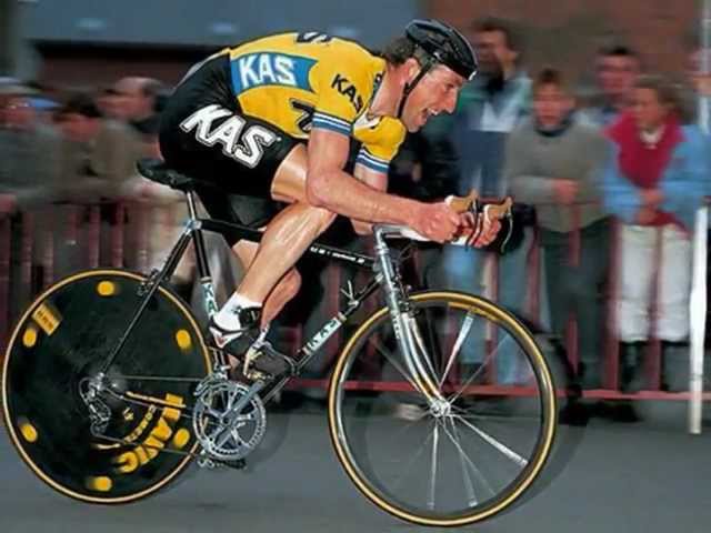
Because Harry said it would be cool, and he was right (ed: we hear Sean Kelly may have provided a bit of inspiration here).
Finally, should it be worn with white or black shoes?
Your Eroica traditionalists would say black shoes with toe-straps but as this is a retro-modern design I’d say either is fine. In my opinion, the ideal shoe for the Centenary kit of such a forward-thinking club is a pair of lace-up, carbon-soled Giro Empire SLX, with crisp white socks (nice and high).